Redesigned and developed a responsive website for a non-profit, focusing on persuading donors and engaging their community.
• 6-month Contract to research, design, and build on Squarespace
• Increased traffic from ~30 to 600+ monthly unique visitors
• Ran a fundraising campaign that was funded 194%
Roles
UX UI Designer - Researcher, Visual Design, User Experience, Marketing & Branding roles, Video Editor
Tools
Background
First Gen Scholars is a non-profit that helps first-generation low-income students get into the college of their dreams – debt-free. In the past, they’ve relied solely on government grants. Their previous website was able to take donations, but it didn’t generate a single donation for more than a year.
The Challenge
First Gen Scholars needs to increase their revenue. They’d love to tap into donors as a new source of income but don’t know how.
My Solution
A data-based, donation-generating website that’s compelling & informative, along with marketing strategy to persuade donors.
Assessing their old website
I needed to evaluate their previous website, and to prove to my stakeholder - with data - which issues we needed to resolve, thus creating certainty that this is the right problem to solve.
I interviewed 6 participants familiar to non-profits and First Gen Scholars. They were ages 45+, 2 male and 4 female.
I asked them to:
Navigate the old FGS website for 3 minutes.
Give a 1 to 10 score on how compelling the website is.
Answer questions about their impressions and experience.
Old website - Home page
User feedback about old website
“A bad website is like a grumpy salesperson. It actively drives customers away by frustrating or irritating them.” - Jakob Nielsen

Our users want to learn more about First Gen Scholars, but the main obstacles on the website were:
Insufficient information about how donations are used.
No third-party proof of the non-profit's legitimacy
Unsatisfying website design made it feel like it could be a scam.
These tests were revealing to the stakeholder, who now believed the website was the right problem to solve.
Research and Strategy
Click on images to enlarge
I completed a competitive analysis, comparing First Gen Scholars with other local non-profits focused on education.
Established non-profit websites are rich in information and transparency, making credibility towards donors a priority.
I turned to the Nielsen Norman Group to study their published articles about non-profit websites. They focused on the donor’s mindset, and their pain points.
Generous donors don’t do it on a whim: they’re always looking for causes to support. They’re also weary of donating to the wrong institution.
I produced a Donor Journey Map with the main takeaways being:
Donors are split into one-time and Recurring donors. The latter usually donate more.
An online presence is great for one-time donors, but recurring ones need additional resources.
A Site Map was created based on information that donors need. This map is an ideal scenario, but only a few chosen pages were designed.
After a discussion with the client about my research findings and our schedule, we agreed on which pages should be created.
I sorted our potential features in a product roadmap to determine design priority. The chosen ones on top are the features essential to donors. We reduced those further, based on the scope of this case study.
My research indicated that donors expect options: payment methods, account creation, and social sharing. This user flow demonstrates an ideal donation process, if we were to design it.
Having these features hosted in our website is ideal to provide transaction safety, and an easy way for donors to spread the word about First Gen Scholars.
Based on all research collected, and inspired by real supporters of First Gen Scholars, a persona was created.
Our ideal donor is continuously looking to give back, seeking out organizations that can create real change in their communities.
Strategic Takeaway
❌ Our goal shouldn’t be to convince all site visitors to become donors.
✅ We have to prove to lifelong-donors that we’re worthy of their support, and demonstrate how actual change will be provided.
Visual Identity
Asked to redesign their logo and brand colors, the only one was to keep the visual identity related to the San Diego Padres. ⚾
Original Logo
The logo had too much focus on the book icon, had too many colors and too many font styles with no clear hierarchy.
For these reasons, my redesign aimed to solve for all these issues, providing a clean, professional look, fit for a non-profit.
New Logos
The chocolate brown and golden yellow were chosen because of their high contrast and clear visual identity. The selected font has sharp edges to give the brand a serious tone. Round edges can be seen as playful or fun, which isn’t the identity we’re promoting.
First Gen Scholars is focused in San Diego County, so the color scheme retains a San Diego visual identity because of it’s association with the SD Padres.
Lo-Fis were skipped - client decision
An important fundraising date was happening soon after the style tiles were developed. The owner chose to accelerate the project deadline, so Lo-Fi wireframes were skipped. Mid-Fis were created in Figma.
Mid-Fis
My research indicated that donors absolutely need to learn the following from our website:
Non-profit’s mission: who, what, when, etc.
Accountability & social proof.
Demonstrate success stories.
Transparency with financials.
Ways to get involved.
Providing this information builds trust with donors, shows transparency, and allows 3rd party proof of being a legitimate entity with real results.
I laid out this Mid-Fi as a starting point for discussion with the client. We began polishing all details.
First iteration of home page
The Mid-Fi feedback loop allowed us to decide the following specs:
Hierarchy of information: Priority given to main goals of non-profit, top achievements, and explaining challenge being solved.
Decision to not use stock images: Trust and reputation is key for donor support, so all images must be from actual students and events.
Iterations of copy for cohesive messaging
Social proof: Financial & tax info, 3rd party verification of organization, other institutions that support us.
Icons and graphics style consistency
Use of color in sections and icons
Use of a video hero section: Finding the right video that can visually explain part of our mission
In addition, ChatGPT was used to create rough drafts of the website’s copy. By prompting constraints on what our messaging should and shouldn’t be, AI produced writing that I later edited and polished.
Third iteration of home page

Once the owner approved the major design choices, I built the designed pages onto Squarespace.
My client decided that Hi-Fis would also be skipped because of the fundraising deadline.
Once the site was live on Squarespace, select users could access and provide feedback about the new design. Also, we could continue editing and modifying as we continued making design choices.
At this point, I created all major assets and variations:
I designed logos for all things website, social media, and marketing.
I created a consistent and color-branded icon family.
I interviewed users based on research, then edited and published promo videos.
Fortunately, the MVP website went live before the original scheduled date. However, designing onto a site-builder host like Squarespace reveals a lot of limitations. I spent loads of time creating custom code to overcome these, or understanding strange site behaviors & creating workarounds.
An advantage of using this host was having enough control over the responsiveness of the site. We didn’t have time for a deep dive into custom coding, so we were grateful for this Squarespace feature.
Delivered Product
Now live, the new website was promoted as part of a week-long fundraising campaign. By the time the fundraiser ended, our goal was surpassed: Funding reached 194% - almost double our goal!
In addition, my new website has increased traffic drastically. It used to average ~30 visits/ month, but it now averages 600+ unique monthly visits.
On top of that, there has been organic donations once every 3 days!
First Gen Scholars now enjoys a new revenue stream - thanks to a responsive website that’s compelling to donors.
Final Usability Test
Once our website was live, my final task was to evaluate it’s usability. Four out of the six original usability test participants agreed to score the new design.
I once again asked them to:
Navigate the new FGS website for 3 minutes.
Give a 1 to 10 score on how compelling the website is.
Answer questions about their impressions and experience.
Lessons Learned
Scoping work and timeline is challenging, especially since it was my first paid UX contract. However, years of client work taught me to provide a structure: I gave my stakeholder a timeline, and let him know we’d have daily communication about updates, progress and changes.
The biggest shock was in recreating designs from Figma into Squarespace. Any website builder has limitations, and I learned to quickly identify these & find workarounds. Constraints should always be kept in mind: I learned this lesson through Architecture, my previous career.
Be wary of 3rd-party tools. The client-chosen donations processor was buggy and problematic. It was up to me to troubleshoot it, call & email customer support, and make it work: I stepped up and figured it out. It was frustrating and time-consuming, but you have to go above and beyond for your clients - especially with one as supportive as mine was.
More Projects
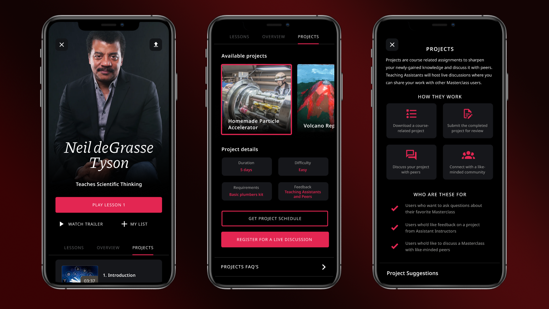
Masterclass: Added a research-based social feature for e-learning platforms.
San Diego UX: Organized a social & professional UX community


