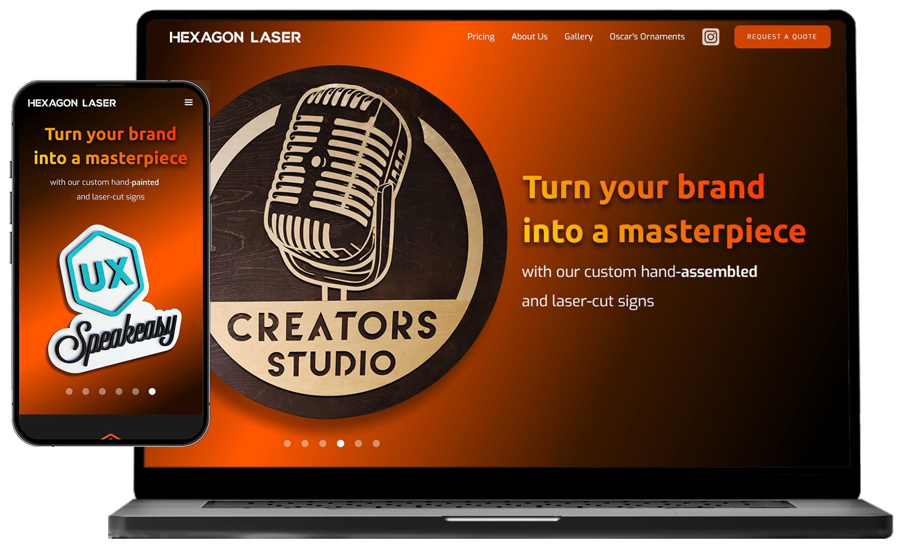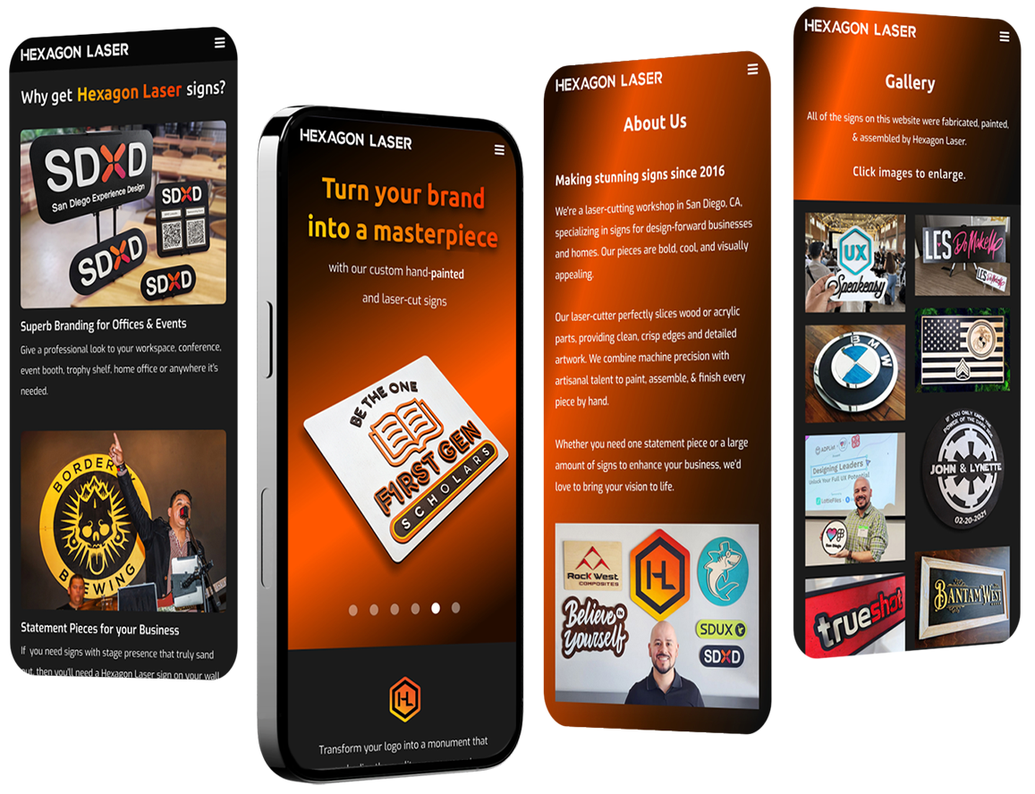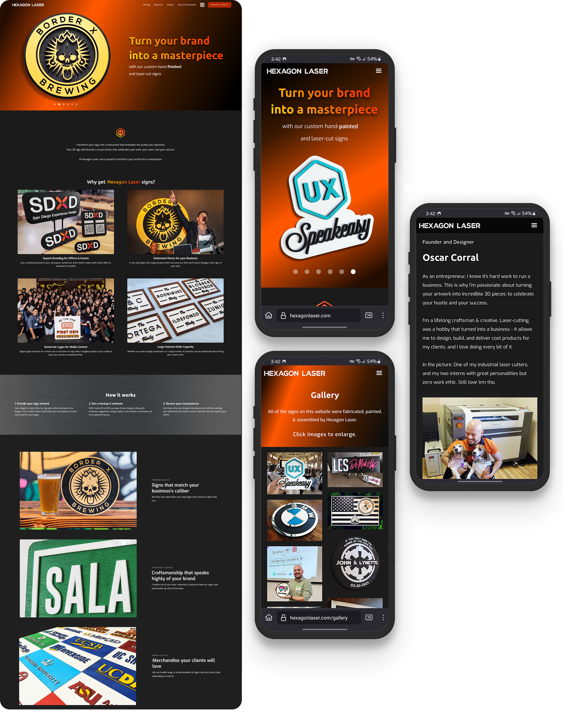
Brand identity, responsive website design, and Webflow implementation for a modern sign- fabrication & design company
Roles
UX UI Designer - Research, Interaction Design, Visual Design
Tools Used
Background
Hexagon Laser makes bold & stunning physical signs. They need a website that increases their conversion rates. Their products look spectacular, but the process of ordering custom work isn’t simple.
Problem
How might we design a website that both highlights the quality of the products, while clearly explaining their custom order process?
Challenge
Design a bold website with great product photography, while prioritizing clarity regarding their service. Product images should draw in users in, while the site educates clearly, builds trust, and entices conversions.
Hexagon Laser specializes in crafting stunning physical products, working with clients to understand their needs and produce tailored designs. As a UX designer, I completely rebranded and redesigned their website.
My focus was on enhancing usability to improve conversion rates, making it easier for clients to understand services rendered so they confidently request a quote.
Buying custom products online can be daunting and unpredictable.
Users have been disappointed by an ordered product without being able to return it. Others don’t want to risk buying from a brand they’re not familiar with. Trust might be the focal issue when dealing with online stores selling custom goods.
But how can we be sure? And how can we address it in our site design?
User Interviews
To gain detailed insights into custom product purchasing behaviors, I interviewed 9 users who’ve bought custom physical products online. I asked them to:
Enlist what information was essential to their purchase
Enlist pain points and aggravating situations
Describe specific situations where users had positive or negative experiences
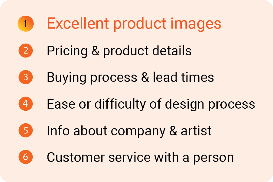
After sorting and analyzing the data, the results are below:
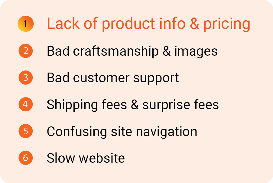
Most important info needed
Biggest pain points
User Insights
To build trust towards the brand, users want to understand the value of the products, they want to appreciate the quality, and they need to understand the buying process to move forward.
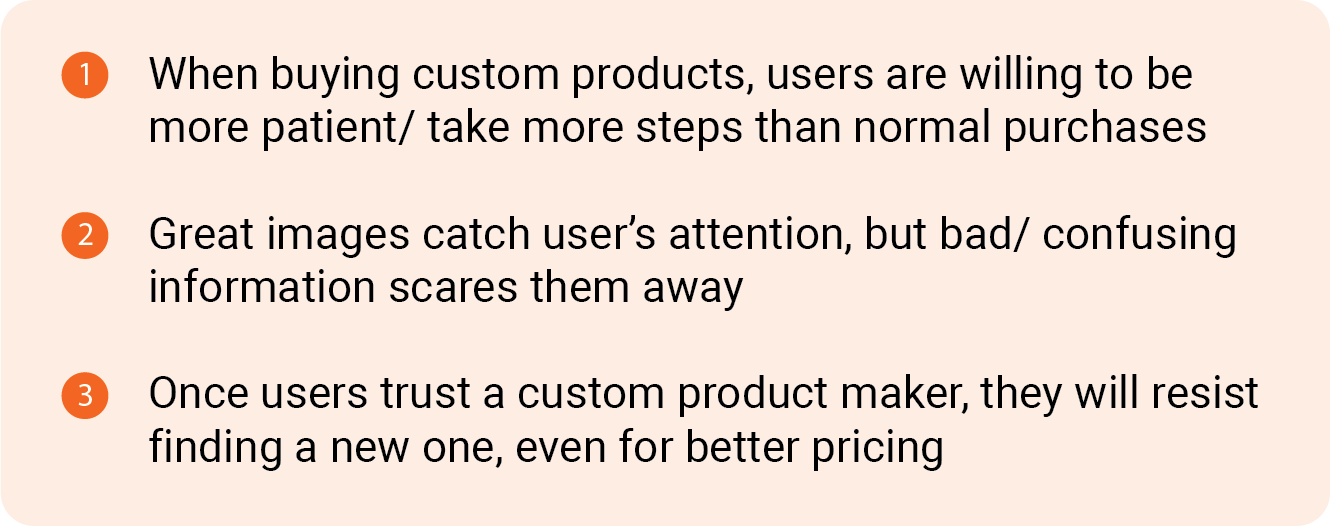
Out of these facts, I synthesized three principles that should guide our store design:
Design principles derived from research
Visual Identity
For the website’s look, I took inspiration from their existing logos and branding. They’re a design and fabrication studio that uses bold, bright, energetic tones for their logo. Their products match this style, featuring bright colors and interesting material features.
Since the website must remain focused on product images, a dark theme was chosen since it helps images stand out. Bursts of orange tones are used throughout the site, creating a visually distinctive look that doesn’t take attention away from product images.
With these guiding principals in mind, sketches were made, Figma designs were iterated upon, and a live site was created using Webflow.
More Projects
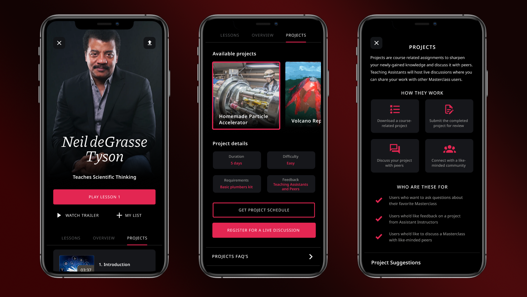
Masterclass: Added a research-based social feature for e-learning platforms.
San Diego UX: Organized a social & professional UX community

