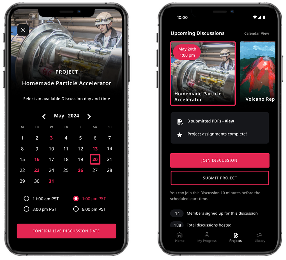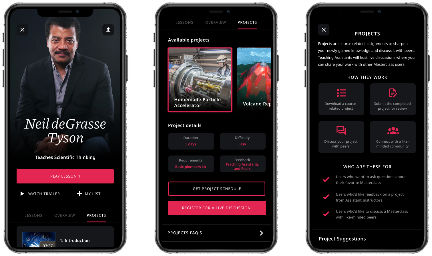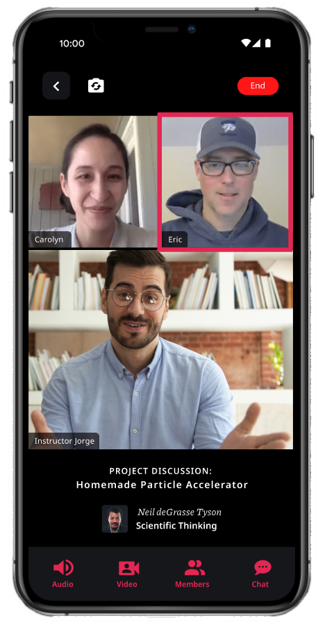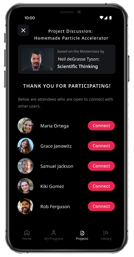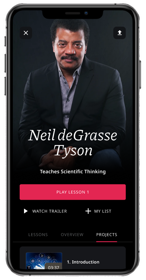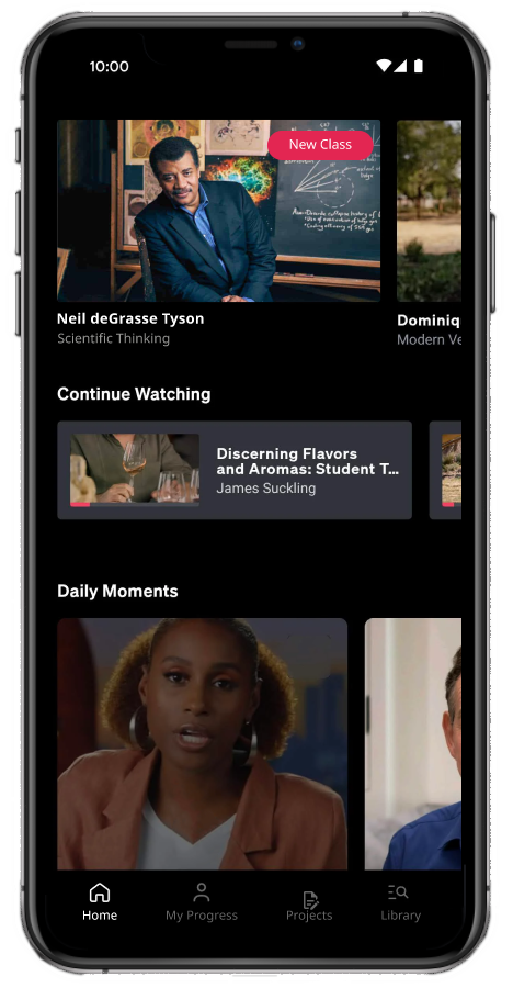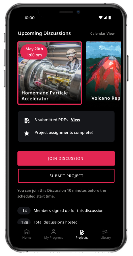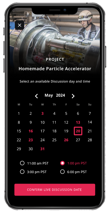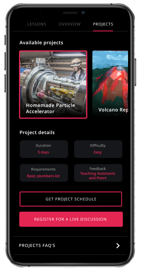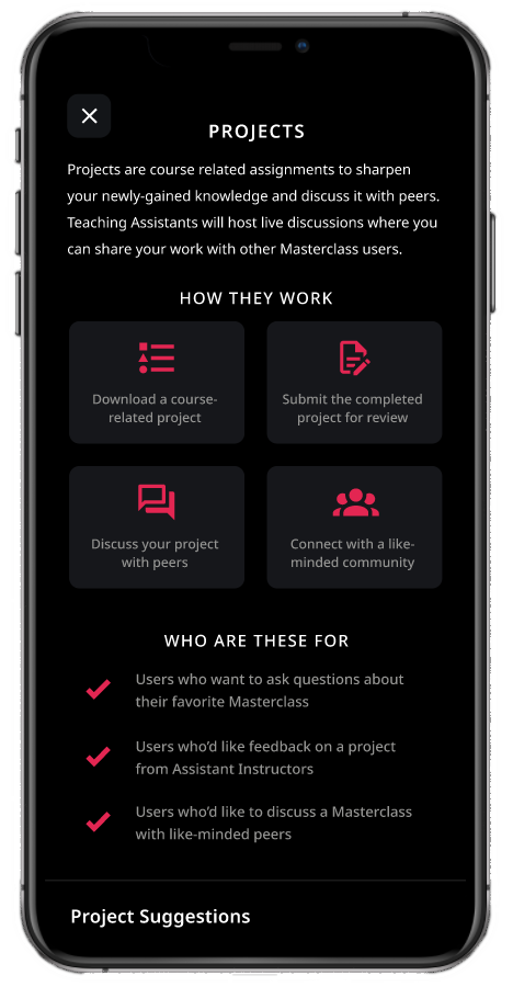
Added a research-based social feature, attempting to alleviate the sense of solitude in most of today’s e-learning platforms.
Overview
Roles: UX Design, Research, Usability Testing
Tools: Figma, Lookback, Adobe Suite
Format: Mobile App
Masterclass.com is a leading e-learning platform that’s looking to improve their user experience. My task was to discover and design a mobile feature that provides a unique and engaging experience for users.
The Challenge
My research revealed a common e-learning problem: E-learning is a solitary experience.
Also, the solution has to be compatible with all of Masterclass’ existing and future courses.
How can I solve for both of these issues?
The Solution
Projects: Users can complete projects at home that are based on Masterclass courses.
Once complete, users can join live, mediated discussions where they can meet their peers, talk about their projects, and ask questions to a trained instructor.
E-learning has made knowledge accessible to millions, but learners have become isolated from each other by design.
E-learning offers many advantages and has become widely popular, but at the expense of human connection. Most e-learning platforms lack community features that are common when learning in person.
These findings were discovered in educational and health articles, and were backed up by my own user interviews. I aligned 4 participants who have been e-learners for 5 years or more.
I asked about their experience thus far, revealing diverse positive aspects. However, when discussing the negative side, every participant had complaints about having no community features. Users want to ask questions, receive feedback, and interact with their peers, similar to in-person learning.
Participants wish they could interact with users while e-learning.
This became a focal point for this case study. Solitude in e-learning is a common problem that, if solved, would provide a superior learning experience, and would provide a unique selling point.
To confirm this discovery, I performed a competitive analysis.
I examined the leading e-learning companies: they all cater to a defined target audience, and receive millions of monthly visits. However, none of these companies have significant community features.
People visit these websites much like visiting a school, but unlike a school, users never interact with another person - which is an important part of education.
E-learning platforms lack social features for users to meet, share their experience, or work together. This is the right problem to solve.
There’s good reason why companies don’t become social media platforms: problems with moderation, bullying, and abuse can affect the user experience negatively. However, a middle-ground solution is possible.
E-learning users want interaction around their course content, but not another open forum as Facebook or Twitter. My solution needs to be interactive and centered on the courses themselves, while being moderated by a real person who can answer questions and control the conversation.
A Persona was created based on our research and desired goals. The ideal user is a social e-learner who is open to try mediated, safe and educational discussions, much like in college.
She is community-minded, and friendly, yet is weary of internet rando’s and drama.
Creating social features must be done carefully. It needs to incentivize positive interactions and deter negative ones. With these constraints in mind, I defined the Project Goals for my solution:
It must be a social, accountable, and moderated hub for e-learners.
It was at this point where a concept formed. Based on the desired goals, and avoiding social media-type features, I realized my solution should:
Engage the user by providing course-based projects for them to complete individually.
Socialize the project by providing live video discussions specifically about the project.
Moderate the discussions by having trained instructors lead the conversation and answer questions.
At this point, the idea of Projects revealed itself.
Projects: a social feature where users complete a course-based project, and discuss their work with peers and an instructor.
This feature would be designed to use the knowledge gained from any Masterclass.
Projects can be created for all previous and future courses,
Instructors can be trained to moderate discussions and answer course-related questions
Users can learn from each other and forge new connections around their favorite subjects.
Exploring possible features to make up Projects, many safety and accountability features were chosen, as well as features that encourage user connection.
The priority was selected by complexity of feature, and avoiding ones outside of this Case Study’s time budget.
❌ Research Lesson Learned
I performed a Card-Sorting test to determine an architecture for this feature. Unfortunately, the data produced was unusable.
I had 4 users for this activity, and I gave them freedom to name as many categories as they liked. The results were too different: the goal was to discover patterns in user logic, but the setup I provided didn’t produce any usable patterns.
I took this as a learning moment that taught me these three insights:
If I had more time, I’d re-run the card sorting activity applying the lessons learned. I ended up choosing the site architecture based on external research, but not based on data generated by my tests.
The chosen site architecture shows a fully-developed social feature for Masterclass.
While these are all desirable features, the allotted schedule for this project allowed me to design a limited amount of screens.
As an accountability feature, users would be required to verify their phone number.
Verified users would be able to connect with other users after meeting in a discussion.
User flows were created for these two sequences.
The social feature must be trustworthy and engaging - users will discuss course content and form bonds over common interests.
Social features must be created carefully. They need to incentivize positive interactions and deter negative ones, which is a common issue for social platforms.
Initially, the Projects and Discussions features were designed to have increased verification and security, as well as an an onboarding quiz.
The original design would have Projects & Discussions separate from the Masterclass courses.
This was changed later in favor of accessing projects from within a course, since Projects and Discussions will be specific to courses.
Discussions with my mentor and users revealed that this change would be an improvement since existing users would find it easier to navigate and assimilate. This action would be supported by the 6th Usability Heuristic: Recognition rather than Recall. Users would easily find the projects section if they’re already interested in a course, as opposed to finding a new section of the app altogether.
With defined features and a satisfactory Mid-Fis, I moved on to replicate the UI. Style Tiles were created based on the Masterclass Android app.
The existing Masterclass app UI
The new design’s MVP features enable users to:
Download a Project to be completed (PDF download)
Register to a scheduled live Discussion
Attend a live Discussion
Connect with other attendees after the Discussion
Prototype and Testing
I created a Figma prototype with Usability Testing in mind, so intuitiveness and familiarity in it’s UI were key. The premise of the test was that testers were existing Masterclass users getting familiar with the new Projects & Discussions features.
I recruited the same 4 participants from my initial user interviews, since they were familiar with my project. Their tasks to complete were:
Finding and downloading a Project
Enrolling into a live Discussion
Connecting with a user after a discussion
If you’d like to see a video of the prototype, scroll to the top of this page.
Testing confirmed an intuitive and useful interface, and users expressed delight about this concept becoming real
My usability tests received mostly positive feedback. It opened up talks about potential features, things users have seen in different social websites, suggestions on what to create next… It got users excited!
Despite positive feedback, one tester’s insight on a specific feature left me no option but to remove the feature.
I borrowed an idea from an eCommerce site that makes users send a picture of their government IDs in order to verify their identity. The intention was to increase safety and accountability for users. However, a tester did not like this feature and told us why:
Many users can’t obtain a US government ID for legitimate reasons - asking for ID verification essentially gaktekeeping!
We all have blind spots in life and in web design. We can overcome these by listening to our peers and valuing their perspectives. With this knowledge, it seemed immoral to let the ID check remain.
Thanks to this participant, our site is more inclusive than it was before.
If we’re champions for our users needs, we’re likely to create functional & beautiful products that users will love.
More Projects
First Gen Scholars: Redesigned and developed a responsive website for a non-profit.
San Diego UX: Organized a social & professional UX community.

